Fences for Fido
Non-profit Web Redesign
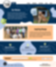
Project Overview
The organization not only provides fences and dog houses to low-income dog owners, but also offer vital services such as spaying/neutering and emergency vet care. By addressing these fundamental needs, we strive to prevent the abandonment or neglect of dogs due to financial constraints. Through a redesigned website, we will highlight the impact of the services and share heartwarming success stories of dogs and their owners whose lives have been positively transformed.
Role
UX/UI Designer
Audience
Interview Insight
We interviewed five individuals about their experiences with nonprofit organizations.
-
Interviewees want to feel connected to the cause they are supporting
-
People wanted to help others either financially or by donating their time
-
How to get involved is not always clear
-
Motivators included new social interactions, learning a new skill, and helping their community
User Story
User Persona
Problem
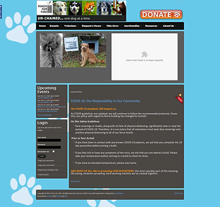
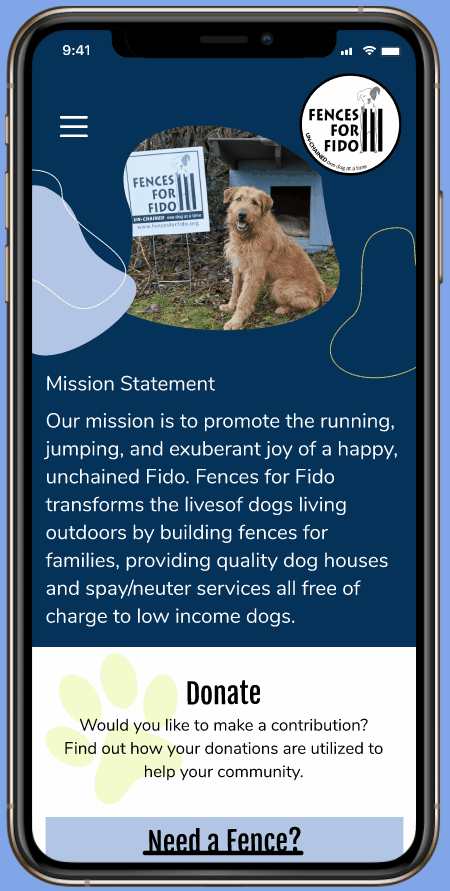
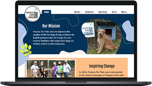
The Fences for Fido website is in need of significant improvements. Currently, it is outdated, disorganized, and lacks a clear mission. These issues create a negative user experience for potential donors and volunteers, leaving them feeling disconnected and confused. The website's outdated design and content fail to effectively communicate the organization's goals and impact. The lack of organization makes it difficult for visitors to navigate and find the information they need. Without a clear mission statement, potential donors and volunteers may struggle to understand the purpose and value of supporting Fences for Fido. To address these problems, it is crucial to redesign the website, improve its organization, and clearly communicate the organization's mission to create a more engaging and informative experience for users.
Finding the Solution
Design
Goals & Needs for Volunteers
-
Wants to get more involved and give back to the community
-
Looking to fill some free time in her schedule with meaningful work
-
Wants to help pet owners & provide safer homes for dogs
Pain Points
-
Busy with work and pets at home but wants to donate free time
-
Unsure about the qualifications for volunteers or required skills
Potential Solution
By effectively and clearly displaying the mission statement, strategically reorganizing the content to enhance its impact, and creating a fresh and invigorating environment, we firmly believe that we can successfully attract a multitude of passionate and dedicated donors and volunteers who will wholeheartedly support our cause.
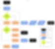
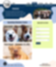
User Flow
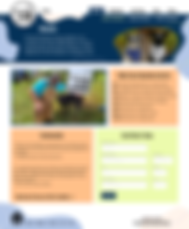
Sketches
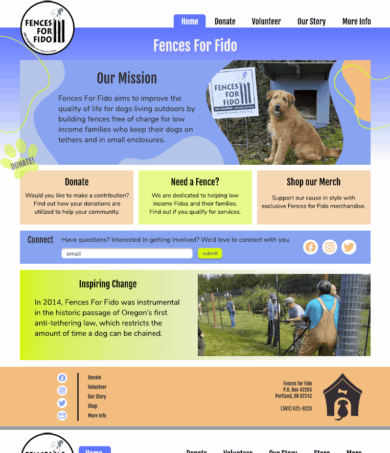
When starting with our sketches, we focused on these Donate, Volunteer, and Our Story sections. Since these are the main focus for our users, we wanted to make them accessible, not only in the navigation, but calling attention to them throughout the home page as well.
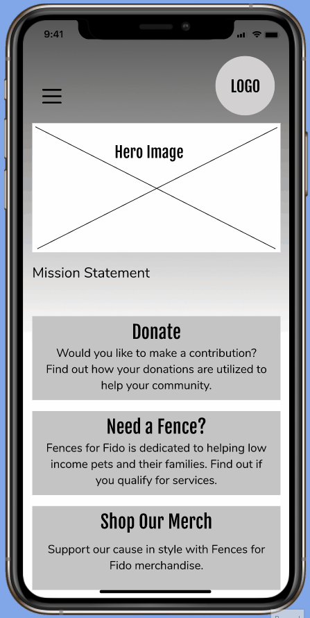
Lo-fi Frames
The biggest change involved the top navigation bar links.
-
Minimized clickable links
-
Reorganized the content in each drop down
-
Made the most important items accessible from the homepage
Mood Board
Our goal was to brighten the site to energize both volunteers and donors.
-
We chose colors that would feel inviting and inspiring.
-
Rounded edges and fun shapes to soften up the experience.
User Testing
Testing Plan:
We conducted five user tests using our lo-fidelity prototype.
Objectives:
-
Does the website draw attention to donations and volunteering?
-
Is the mission of the website clear to the user?
-
Is it organized in a way that is easy to navigate?
Tasks:
-
Make a Donation
-
Sign up for a Volunteer Event
-
Shop for Merchandise
User Testing Feedback:
-
The logo as the home button was not obvious
-
Merchandise was featured on the home screen but hard to find in main navigation
-
"Sign up for an activity" was a button on the Upcoming Events page but also had its own screen which made it redundant and confusing
-
Wanted to be able to commit to making a donation from the main donations page
Design Progression
Iterations in Mid-Fi:
-
Added "Home" tab next to logo
-
Emphasized call to action on donation page
-
Added "Store" to main navigation
-
Simplified event sign up
-
Consolidated event information
Conclusion
Next Steps
-
Conduct new user testing on High Fidelity design
-
Reiterate based on testing results
-
Launch new site design
KPI Tracking and Goals:
-
Higher average in amount of donations per month
-
Increase in volunteer sign ups
-
Increase in repeated donations/volunteers
-
Increase in store sales
Final Thoughts:
Our team members were inspired by the dedication of this non profit to the betterment of life for their communities’ pets. This project presented the challenge of not only creating a visually appealing design, but also one that inspires people to contribute through Fences for Fido.